
Storytelling in data analysis
23.01.2018
Storytelling isn't just about telling a story - it helps to communicate information. It is rarely used to handle data, for no good reason. I'm going to tell you how to use storytelling in reports and performances.
Tell someone that they need to follow safety protocol and it will go straight over their head. Tell them a story about how John got his finger cut off, and the listener will be careful operating the machine. Our brain doesn't like dry facts, it needs vivid emotional examples. In the article we'll use examples to figure out what storytelling is and how you can use it for analytical data.
We prefer a fast-moving plot to a tedious text, which is why journalists, marketers and shop assistants use the approach of 'telling a story'. Not every story can be called storytelling, though.

Efficient Storytelling Criteria
- A clear plot. We involuntarily pay attention to conflicts, which means that the character will certainly have various difficulties along the way.
- Logical narrative. The structure of the story: opening, movement, climax, denouement.
- A bold protagonist. If the reader can relate to him, they will perceive the information you convey much easier.
- Movement pace and emotions. Avoid monotonous narrative, it's exhausting. The emotions that the listener or reader experiences help them make the right decision.
- Bright details. Get rid of unnecessary details, but add small features to the protagonist's image to make him more true to life and bring him closer to the reader.
- Call to action. Casually, with very careful strokes paint the reader a picture of possible scenarios, successful and not really.

Get my book and discover dashboard insights for free
* By clicking the button you agree to the privacy policy
* By clicking the button you agree to the privacy policy
Why use storytelling
It encourages the audience to do what is required: buy, vote, remember, start trusting, make a choice. We use storytelling to attract attention. In other words, we can tell stories just for the sake of the process, but storytelling is aimed at a specific result:
• Passing on corporate values and
• Justifying the rules
• Motivation
• Creating customer loyalty
• Engaging in discussion
• Public speaking
• Communicating information about achievements, events, consequences, benefits, and difficulties.
• Passing on corporate values and
• Justifying the rules
• Motivation
• Creating customer loyalty
• Engaging in discussion
• Public speaking
• Communicating information about achievements, events, consequences, benefits, and difficulties.
How it can be used in analytics
I've seen a lot of speeches and presentations based on analytical information. These have been scientific and technical projects, market research, and business plans. And in most cases, the presenter spoke in a roundabout way, starting from how and where they gathered statistics, what issues they faced, how they tested their hypotheses.
Sounds familiar? Even though the subject of the presentation is important to you, you have to really pull yourself together to stay awake for the 50th slide that will finally show those necessary conclusions.
Here's another scenario. An analyst shows a slide with diagrams and makes a comment:
— on this chart you can see the distribution of clients by average bill;
— here we have financial indicator dynamics compared to the previous year;
— and this table shows our clients' pattern of purchases.
What if I can't actually see? Or if I don't get what the chart means (because you drew it all wrong)? WHAT EXACTLY is the distribution like? WHAT EXACTLY is the dynamic? Is the rate growing or dropping? Is it good or bad? When these questions are left unanswered, the listener gets tired and misses the really valuable information.
The same can be told in a different way:
• 'I'm going to tell you how we lost $5m and how we can get it all back'.
• 'Look, most of our clients' bills are about $20-30'.
• 'Compared to last year the sales volume in this segment has gone up 20% but the profit has remained the same'.
• 'We've studied the pattern of purchases and found a problem. Clients don't buy high margin goods because they are at the very end of the catalog. Let's up them and do a promotion'.
Certainly sometimes it is easy to understand the presentation thanks to the speaker's eloquence. But what if you send your analytics as a document, without a face-to-face presentation? You can tell stories not only with words and text, but also with video, graphics and animation. There is interactive storytelling in data visualization — a story the reader can interact with, for example, choose sections and study the data only in them, zoom in and out, study the content in depth.
Storytelling in Data Journalism
Data already tells you the story, the only thing you need to do is spot it. Who sold how many cars, when and where it happened, what the obstacles were and what helped — numbers will make it possible for you to see events. They will probably convince you in something, encourage you to do a certain thing or change your perception of the situation.
Fight of the Century

This is a simple example of storytelling. Let's switch off from business for a while and look at the fight infographic. In 2017 there was a lot of fuss over the fight between two 'invincible' athletes, Mayweather and McGregor. Even if you didn't see it, you can now follow the whole story and fight dynamics in just one picture.
The aggressive McGregor seemed to be ahead for the first six rounds, but then the experienced Mayweather started to dominate the fight. And we can see why thanks to the diagram — the percentage of the punches he landed was much higher right from the start, whereas McGregor missed a lot and lost a great deal of energy. As a result in round 9 Mayweather landed the max number of punches, which led to a knockdown and his win.
The aggressive McGregor seemed to be ahead for the first six rounds, but then the experienced Mayweather started to dominate the fight. And we can see why thanks to the diagram — the percentage of the punches he landed was much higher right from the start, whereas McGregor missed a lot and lost a great deal of energy. As a result in round 9 Mayweather landed the max number of punches, which led to a knockdown and his win.
World History

Here's a more complicated example. You can get a glimpse at world history from 'one window' in four categories:
Pay attention to pale pleasant colors used in the infographic. Headings clearly convey the content, and a short guide on each page makes the dashboard easy to use. It makes it possible to see all the interesting analytics.
- Geography. You can choose an epoch on the timeline and see civilizations existing then.
- Great empires. There you can see the largest empires by area for all the time or in a certain epoch, as well as see what it looked like on the map.
- Religions. Using several filters (selecting a country on the map; selecting a measurement (number of people/ number of countries/ percentage of people involved) you can see top religions in certain countries.
- Population. Using a colorful filter (multi colored circles on the map representing cities) one can see the position of a city according to the number of inhabitants among top cities by three categories (growth percentage, growth since 1950, state as of 2015)
Pay attention to pale pleasant colors used in the infographic. Headings clearly convey the content, and a short guide on each page makes the dashboard easy to use. It makes it possible to see all the interesting analytics.
Winter Olympics

A complex piece of work and vast statistics. This dashboard comprises over a century of Winter Olympics history. You can analyze the statistics broken down by various categories in tabs. Here are a few examples.
If we select 2014, we can see the countries with the largest number of medals won — 33 for Russia, 26 for Norway, 25 for Canada and so on. Next we can see the breakdown by gold, silver and bronze. The number of countries winning the medals, the total number of athletes and winners are highlighted as the key indicators.
Following the links we can go to other tabs. There we have a full list of top countries or athletes and the number of medals they won, as well as Venn's diagram. It shows who won which combinations of medals. For example, 18 countries won all kinds of medals, and only Slovakia had one gold. And only two sportsmen, Tora Berger from Norway and Shim Suk Hee from South Korea, won the full set of medals.
Besides medal combinations this work contains 8 more tabs:
• country profiles with the information about the number of medals, sportsmen, winners and games;
• medal winners, which you can filter according to year and country (you choose a sportsman to open their profile with the information about medals won, games they took part in, kind of sport);
• medal winners characteristics (leaders in weight, height and age); records (filters allow to see the Olympic records in different kinds of sports);
• expansion with interesting statistical data by Olympics years or participating countries;
• mapping, the information about champions on the map;
• historical changes, graphs showing changes in Olympic winners for certain time periods (you can track ups and downs);
• detailed description of the Olympics events.
Bicycles in Boston

This is a very convenient dashboard to track the statistics of using public bicycles in Boston. You can choose a certain station, a desired time period, look at activity according to the time of day or night, and see the users' demographics. Different visualization elements are used here — a map, KPI cards, a bar chart and filters.
How you can use storytelling in data analytics
- Use a clear structure of the report — introduction, problems you are trying to solve, description of the result, and conclusion.
- Think about the actions people are supposed to take after your presentation — invest, buy, get inspired. It will help you understand how to tell your story.
- Look for interconnections between data and personalize them to make your story coherent and easy to remember. Add characters, catchy details. Just don't overthink it.
- Don't use too much data — a human brain can focus on three to five facts. People must be able to follow your story.
- Use line colors and thickness in order to highlight certain thoughts. Use black for negative things, green or yellow for positive events, and red for risks.
* By clicking the button you agree to the privacy policy
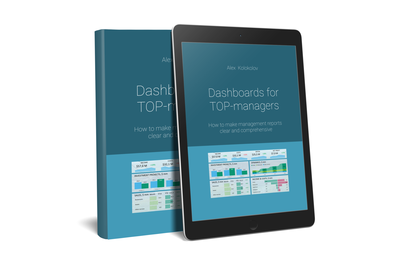
You'll find simple and precise rules for creating great dashboards in my book «Dashboards for TOP-Managers». We'll send you a free copy of it via email
Get my book and discover dashboard insights for free
+995 557 525 549
Georgia, Batumi, Ximshiashvili 7