EN
RU
About
Trainings
Our services
Blog
Gallery of Dashboards
Internship
Open catalogue
Corporate accounting
Dashboard for CEO
Customized data visualization
Personal counseling
Corporate training
Data storytelling with Power BI
Power BI for Business Users
About
Gallery of Dashboards
Blog
Our services
Open catalogue
Corporate accounting
Dashboard for CEO
Customized data visualization
Personal counseling
Trainings
Corporate training
Data storytelling with Power BI
Power BI for Business Users
Internship 2022
RU
EN
Dashboards and Interactive Reports
Transformation tables into clear and beautiful visuals
Easy and fast data analysis
Prompt decision making based on data
Main page
Main
→
Gallery of Dashboards
A business dashboard is an information management tool that is used to track KPIs, metrics, and other key data points relevant to a business, department, or specific process. Through the use of data visualizations, dashboards simplify complex data sets to provide users with at a glance awareness of current performance, revenue and profit.
See the collection of dashboards by Institute of Business Intelligence.
All dashboards
Finance & Marketing
Sales
HR Analytics
All dashboards
Finance & Marketing
Sales
HR Analytics
Customer Base Flows
Chord chart shows flows by the best way and rated chart allow to compare the clusters
More details
Year Report
All the aspects of business in 1 Power BI report. Left menu allows to go from page to page
More details
Competitive Position
Set of standart charts and diagrams capaciously and clear shows the large volume of data
More details
Marketing KPI
Interactive sales funnel is an advertising efficiency assessment basis on different channels
More details
Customer behavior
Non-standard visualization helps to understand structure of expenses on hierarchy of categories
More details
Finance
Full incomes, expenses and investment picture at the dashboard Finance of 4 pages project
More details
Digital Marketing
Analytical dashboard with a large number of filters and a set of key indicators
More details
Customer Profile
Complex characteristic of clients - simple visualization, but 100% hit in the purpose
More details
Back to gallery
Customer Base Flows
Goal
customer flows need to be displayed clearly even in a static illustration.
Solution
A chord diagram is an optimal solution for any flow type, which, in this case, a customer flow between multiple stores. Additional charts help filter the necessary customer profiles and track the inflow and outflow dynamics.
How It Works
Year Report
Goal
The objective is to collect comprehensive post-performance analytics of all business areas for the company shareholders, and to present several dashboards in one project.
Solution
You can switch between dashboards in the side menu. 7 activity-specific dashboards have a standard structure - KPI level and 2 levels of diagrams and tables. There are all the key indicators from each dashboard on the homepage. All elements are linked through a branch table in the Security and Quality tab, presented as an example. Besides, each diagram has a unique local filter. KPI affiliation with a certain index on the right is emphasized by the color of the plate so that the numbers remain neutral and easy to read.
How It Works
Competitive Position
Goal
The objective is to monitor market share changes relative to competitors in three business areas: the number of stores, the customer's share and the number of visits, as well as the dynamics of the customer flow and outflow.
Solution
A rare case of successful bubble chart use includes customers share, average check, and turnover % shown together on the chart. A conditionally formatted table is the best option to show a large and required data volume.
How It Works
Marketing KPI
Goal
The objective is to analyze the results of advertising campaigns, to identify the most effective user acquisition channels and track the costs.
Solution
The purchase funnel is the best option to understand customer acquisition and conversion. Treemap (tree-shaped chart) is better to visualize the channels cost structure than the traditional pie chart.
How It Works
Customer behavior
Goal
Customer behavior monitoring: what do they purchase and which shopping centers choose to spend their money.
Solution
The Sankey diagram may seem complex at first glance, but it helps to display customer flows not only by shopping centers but also by goods and service category. A tag cloud clears a report from a large number of diagrams and focuses on the leading stores' names.
How It Works
Finance
Goal
Presentation of all the financial KPIs on one sheet for the CEO, creating a visual basis for strategic business planning.
Solution
KPI cards, charts, tables with conditional formatting are clear information layers. A waveform chart is a non-standard diagram, which presents the rating of the service by profitability over time.
It has a vivid color layout and background related to the business area.
How It Works
Digital Marketing
Goal
The objective is to evaluate Internet campaigns performance by 6 key and 2 additional indicators and to track the plan performance over periods and channels.
Solution
Several filter types of different styles do not overload the dashboard and make it interesting. Three-level KPI cards include 18 key indicators and keep them readable.
How It Works
Customer Profile
Goal
The objective is to present the key customer features in three sections: demography (age and gender, income), expenses (cost structure and shopping time), and in-store purchases from competitors within industry and related industries.
Solution
Although the Tornado and Treemap diagrams are non-standard, they are tightly integrated into our lives and allow us to solve various problems conveniently. The heat chart is rarely used, but it is most suitable when you need to show the gradation of values in 7x8 cells.
How It Works
Training Analysis
Big dashboard according to the analysis of quality and learning efficiency of employees
More details
HR-Metrics: Finance
Main financial KPI in HR-department to control plan implementation and react to changes promptly
More details
Staff Classification
Dashboard for HR-director gives a complex vision of the company line-up. Made in MS Excel
More details
360 Assessment
Radar chart shows week and strong competencies of every person in company the best way
More details
Recruitment Analysis
Beautiful and simple dashboard to analyse the strategy of staff recruitment
More details
Reasons for Dismissals
Two-level sankey for the understanding of reasons for leaving of employees from the company
More details
Payroll
Capacious tables on brands and divisions and complicated KPI with bar charts for assessment of changes
More details
HR. Start page
Strategic dashboard for assessment of HR key indicators, wage fund and salary in dynamics and process of recruiting
More details
Performance Assessment
Dashboard shows the dependence of results of productions on qualification of workers
More details
Employee Profile
Complex dashboard about social and psychological characteristics of every employee in the company
More details
Engagement Index
Dashboard shows results of inner survey about engagement of employees into the company life
More details
Back to gallery
Training Analysis
Goal
The objective is to track employees' feedback on the completed training and to plan an efficient advanced training program.
Solution
Several pivot tables with various conditional formatting - histograms and font color in cells display a high-capacity large data volume.
How It Works
HR-Metrics: Finance
Goal
The objective is to compare financial metrics with staff costs, to show the payroll share in revenue, and toidentify weak points in budget allocation.
Solution
The dashboard is visually divided into 2 parts: financial KPIs of the company and its departments and HR characteristics. By filtering departments, you can analyze the financial results and costs of each.
How It Works
Staff Classification
Goal
The objective is to show the company structure in the context of employee groups and department categories using standard tools in Excel.
Solution
A clear approach is used to separate data into levels: slicers, KPI cards, 2 diagram levels. The alternation of stylish doughnut charts and histograms creates the diversity effect and helps to combine information into conceptual blocks (left and right half).
How It Works
360 Assessment
Goal
The objective is to to assess staff competencies and develop an effective training programme
Solution
The radar chart at the dashboard core displays the full picture of expertise and points up the performance indicator that needs to be developed. KPI card indicators display the spread of survey results and employee self-esteem.
How It Works
Recruitment Analysis
Goal
Tracking the dynamics, estimating recruitment efficiency within the company, and to improving HR strategy.
Solution
Recruitment funnel shows conversion rate at each stage. The dynamics and stage duration are displayed with 2 related diagrams - a graph and a bar chart. A waveform chart displays the dynamics of the key stages.
How It Works
Reasons for Dismissals
Goal
The objective is to analyze the staff history - where they came from and where they left after dismissal, as well as the potential causes of dismissal to prevent them.
Solution
Two-level Sankey chart displays a wide range of the reasons for dismissal. Filters for various indicators are built in the charts.
How It Works
Payroll
Goal
Evaluation of the payroll share in revenue, payroll share changes over the previous periods and plans, and adjusting the payroll distribution across departments.
Solution
Custom block with key indicators: complex horizontal bar charts with variation indicators within the compared figures. Filtered values in conditionally formatted tables display KPIs within the required categories.
How It Works
HR. Start page
Goal
Representing the HR department key indicators and tracking the staff rotation tendency between departments.
Solution
The tornado diagram up front perfectly demonstrates the headcount ratio and average salary in the department, and the mixed histogram on the right visualizes the gaps between the headcount and staff turnover by month. Tornado filtering shows staff turnover dynamics within each department. The funnel at the bottom reflects the recruitment conversion for newly opened positions, and the color saturation gives a sense of candidates approaching positions in the company.
How It Works
Performance Assessment
Goal
The objective is to identify whose performance adversely affects production output and establish a staff development program to focus on poor performance.
Solution
The effectiveness of each process is in the first place. By using filters and table rows with conditional formatting, you can assess an employee's competence in each process. The custom waveform chart shows the rating change in quarterly performance success by the brigade.
How It Works
Employee Profile
Goal
The objective is to gather all the available information on social, material, and psychological characteristics of each employee to improve the motivation system.
Solution
There is no upper level of KPI since there is no need in general or average indicators. The structural picture by departments, which is presented in charts, and information about each particular employee can be filtered in the large table below. Upfront there is a 100% stacked column chart, which sets the motivation trend - money and career. Infographic elements (icons in the diagram of social dimensions) are used for easier emotional resonance. This also works for space-saving since text takes up more space.
How It Works
Engagement Index
Goal
The objective is to visualize survey findings of employees' involvement and performance management, and to improve the company atmosphere to a higher quality level.
Solution
The dashboard is divided into 2 conceptual blocks of the same structure: KPI, the answers to specific questions, and the employee possible answers distribution diagram in the form of a 100% stacked bar chart. The blocks are divided from each other, but there is also filtering by questions; the productivity category also filters the questions on the right.
How It Works
Sales Geography
Bright colours to show regional sales characteristics. Case there a map is a working tool
More details
Wellness Club
How huge data based of 3,5 thousands of customers could be shown in easy and readely way
More details
E-commerce Performance
Complex representation of results of sales on managers, sales channels and clients
More details
Sales by Channels
3 charts with the same structure for easy perception of the same data on different key indicators
More details
Cost Formation
You see cost of the product on divisions: dynamics and factors of change
More details
Back to gallery
Sales Geography
Goal
The objective is to see sales volume at a glance, to understand which product is sold better, in which region and how this is related to the product's geography.
Solution
This is a rare chance of applying the map when it displays the affiliation of regions to macro-regions and filters other diagrams without additional sections. Sankey diagram clearly shows the product sales distribution by region, and several standardized bar charts aligned against each other allow you to compare sales in different units.
How It Works
Wellness Club
Goal
The objective is to analyze profit indicators and a map of fitness-club network customers, to find growth opportunities
Solution
There is a trendline (sparkline, which shows the trend data over the last year) in each KPI card in addition to a large dynamics chart. There is an address of the individual client on the map. Filters by gender and age may help to find interesting dependencies between customer residence and club location and thus to develop a customer capture system for a certain territory.
How It Works
E-commerce Performance
Goal
The objective is to display the margin plan/actual by managers, sales channels, and product segments, account base structure, and the dynamics on a single dashboard.
Solution
Managers plan performance is presented in the form of a custom Bullet-Chart by OKViz in Power BI, sales funnel transactions, contracts, payments and conditional formatting tables, designed "in the chart from".
How It Works
Sales by Channels
Goal
The objective is to show the key company activity indicators - the dynamics and % of sales plan performance, stock plan, and marketing budget for all market outlets.
Solution
A set of visualizations of the same type for each of the three directions from custom two-level KPI cards, tornado diagrams, and flow charts.
How It Works
Cost Formation
Goal
The objective is to evaluate indicators that increase product cost and to solve the issue of bonus payments to the heads of departments.
Solution
The waterfall chart displaying cash flow is turned upside down for convenient placement of the legend. It is scaled in a way that makes a small changeable part of it noticeable. Color indicators are connected to the values in KPI cards.
How It Works
Dashboard
for CEO
Get a management control system for small and medium-sized businesses for a month
a clear system of KPIs to manage your business
the visual and clear reporting system for business users, not for technical ones
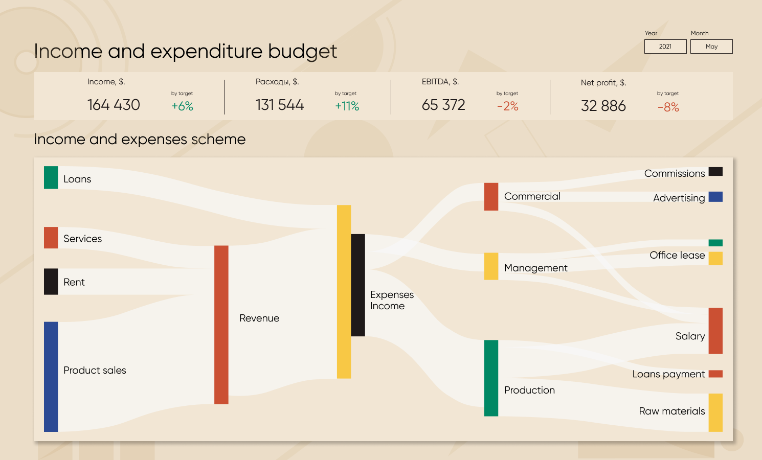
a clear financial picture: revenues and expenditures of your business
Order a business dashboard
Dashboard for CEO
Get a management control system for small and medium-sized businesses for a month
Your request is successfully sent
We'll soon get in touch with you.
Required field
Please enter correct e-mail
Please enter correct name
Please enter correct phone
Send
Required field
Please enter correct e-mail
Please enter correct name
Please enter correct phone
{"0":{"lid":"1531306243545","ls":"10","loff":"","li_type":"nm","li_name":"name","li_ph":"Your Full Name","li_req":"y","li_nm":"name"},"1":{"lid":"1562588755417","ls":"20","loff":"","li_type":"nm","li_name":"company_name","li_ph":"Company Name","li_req":"y","li_nm":"company_name"},"2":{"lid":"1531306540094","ls":"30","loff":"","li_type":"em","li_name":"email","li_ph":"Your E-mail","li_req":"y","li_nm":"email"},"3":{"lid":"1562155519708","ls":"40","loff":"","li_type":"ph","li_name":"phone","li_ph":"Your Phone","li_nm":"phone"},"4":{"lid":"1562155707083","ls":"50","loff":"","li_type":"ta","li_name":"comment","li_ph":"Describe the task and we will prepare in advance","li_req":"y","li_rows":"4","li_nm":"comment"},"5":{"lid":"1562660948053","ls":"60","loff":"","li_type":"hd","li_name":"amocrm","li_value":"english","li_nm":"amocrm"},"6":{"lid":"1562660963110","ls":"70","loff":"","li_type":"hd","li_name":"modul","li_value":"Заказ консультации","li_nm":"modul"},"7":{"lid":"1562660991745","ls":"80","loff":"y","li_type":"hd","li_name":"AK_1","li_value":"AK_1","li_nm":"AK_1"},"8":{"lid":"1562660998695","ls":"90","loff":"y","li_type":"hd","li_name":"AK_90","li_value":"AK_90","li_nm":"AK_90"}}
Order for Free
Order an Expert Consultation
We will discuss problems of your business, options of solutions, prices and terms
* By clicking the button you agree to the
privacy policy
Blog
Our services
Trainings
Privace Policy
+995 557 525 549
Georgia, Batumi, Ximshiashvili 7
About
Cookie Policy
Gallery of Dashboards
We encourage you to review and to agree to our
Privacy Policy
,
Cookie Policy
and
Terms
.
Agree
Close