Analysts vs Designers
I usually write about visualising figures - about diagrams and their combinations on dashboards. But what should we do if we need to visualize a text?
A client asked me to create a presentation for a partnership programme. The company develops software for business analytics, i.e. operates as a vendor. Their agents need a clear, persuasive explanation of the ways to sell the product to the end customer.
Besides multiple financial reports and diagrams, the presentation featured dense, extensive text. Let us look at two diagrams: one on client maturity and the other on sales processes. I decided to outsource this task to the designer. I liked his portfolio and I had some positive feedback from my friends too. What could have gone wrong?
Client maturity
The idea is simple: 'Sell to those who are ready and willing to buy. The client that tried and failed is a 'hot' client. It makes no sense to sell to 'cold' clients'. I set about to develop the idea and drew some parallels with the hierarchy of needs.
This was my draft which I created as an analyst; then I submitted it to the designer.
This was my draft which I created as an analyst; then I submitted it to the designer.


Get my book and discover dashboard insights for free
* By clicking the button you agree to the privacy policy
* By clicking the button you agree to the privacy policy
The text is hard to read; the overall look is rather crude. Let us see what the designer made of it.

Looks better:
• The idea of maturity has been supported with a gradient from cold blue to warm green. Green means good. Most people perceive green as a positive colour as compared to the mixed associations with orange.
• The pyramid has been divided into two parts and the text made more readable - the relationships inside and outside the pyramid are now clear. The text from the top of the pyramid has been moved to the left for greater visibility.
But if we look closely, we will see some faults. The gradient is not consistent; from the bottom of the pyramid it changes from blue to dark blue, and then suddenly changes to green.
I write my commentaries to the designer and receive a new version:

Well-done! Fonts have been improved, the figures aligned, gradient smoothened. Something to show to the client.
Client maturity
This idea is more complex. We need a visual representation of the agent and the vendor on every stage of the sales. We need to accentuate the key tasks.
The background information is presented in a table. At this stage I cannot see how to visualize this without losing the meaning.
The background information is presented in a table. At this stage I cannot see how to visualize this without losing the meaning.

I submit the table to the designer - let him do some creative thinking. And he 'spoils before he spins'. The designer used the idea of the pyramid and the gradient again, but this time:
• he has lost the task division by vendor and agent;
• has drawn the whole process in a reverse way.
• he has lost the task division by vendor and agent;
• has drawn the whole process in a reverse way.

I introduce a number of corrections, and we try to make it right (I am beginning to think I would have done better myself).

The second draft is better: the designer turned the table over, and the stage sequence is now more understandable. He has accentuated the key tasks. But still - there are some commentaries to make.
• the designer has not separated the tasks of the vendor and those of the agent;
• the focus is on the stage numbers, but not their names, which is wrong; - numbers 1 to 6 carry nto informational load and should therefore be removed.
We correct it again.
• the designer has not separated the tasks of the vendor and those of the agent;
• the focus is on the stage numbers, but not their names, which is wrong; - numbers 1 to 6 carry nto informational load and should therefore be removed.
We correct it again.

The third attempt gives us the final version. The designer is professionally hurt: all his creative effort has been rejected and changed for an uninteresting, unoriginal slide.
I agree - it is not original, but very clear. Nothing is unnecessary, every element renders a meaning and simplifies the overall perception. My analytical experience tells me the final choice is right.
I agree - it is not original, but very clear. Nothing is unnecessary, every element renders a meaning and simplifies the overall perception. My analytical experience tells me the final choice is right.
Conclusions
• Designers lack analytical thinking, while analysts lack creative thinking. Striking a balance is hard but necessary.
• If you are an analyst, develop your visual thinking, come up with imagery. Results would depend on your tasks. You will easily find a designer for a certain project and realise your tasks, if you can draw a sketch on tissue paper.
• If you are a designer, go into the nature of the data before you start drawing. Career growth and financial success come with the ability to understand your client, with the ability to see what he/she is trying to explain, what solution he/she needs. Mastering new visual effects and graphics will not give you the necessary competitive edge.
* By clicking the button you agree to the privacy policy
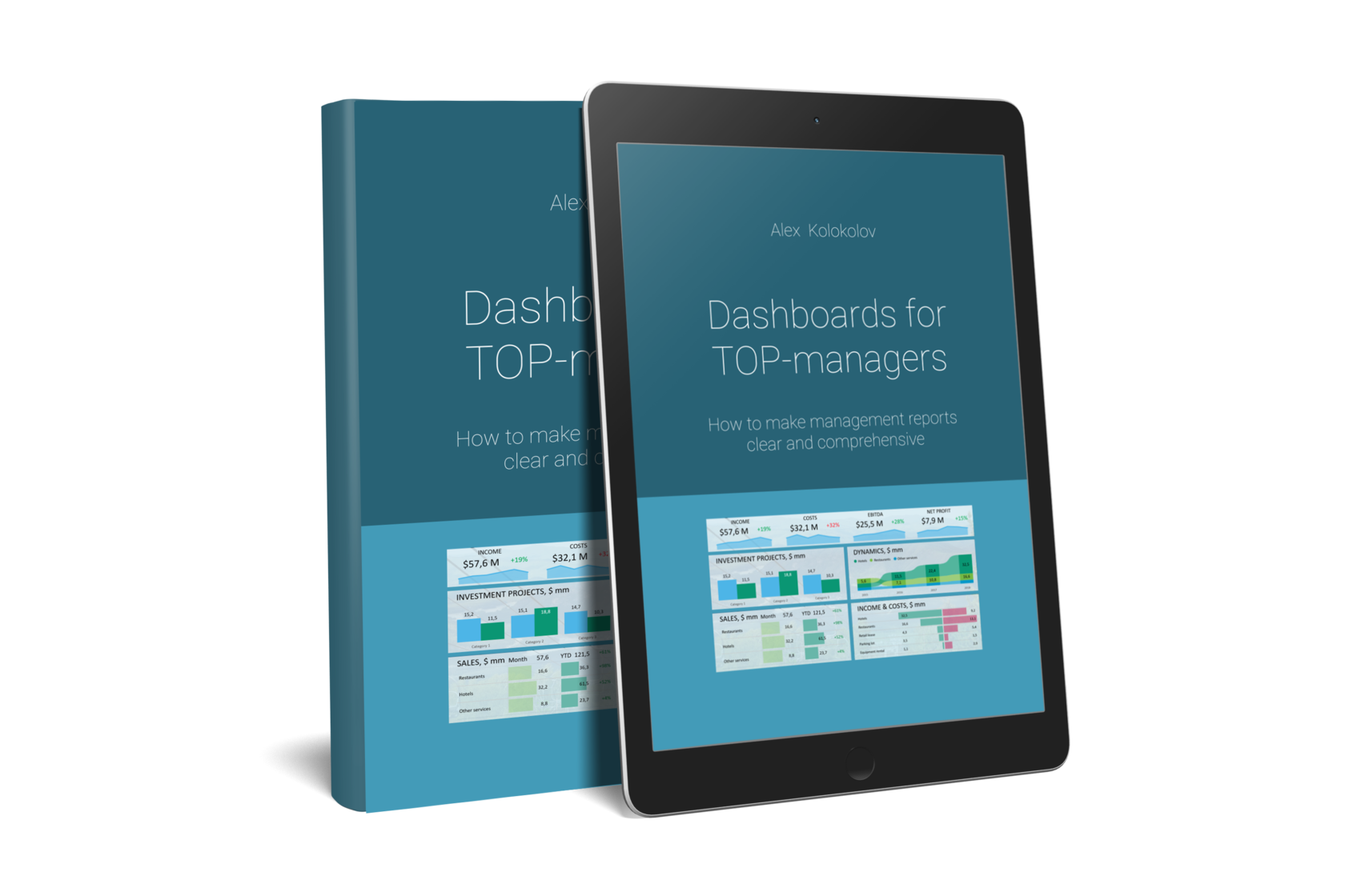
You'll find simple and precise rules for creating great dashboards in my book «Dashboards for TOP-Managers». We'll send you a free copy of it via email
Get my book and discover dashboard insights for free
+995 557 525 549
Georgia, Batumi, Ximshiashvili 7