Are you ready to report on your KPIs?
05.12.2018
December is the time for summarising financial results and approving budgets. In my post today I will be covering the TOTALS - an important part of a corporate report. Let us so far talk about visualizing key indicators.
What is KPI and what KPI are there?
KPI (Key Performance Indicator) is the key indicator of effectiveness. This notion has many interpretations. It is often seen as a planning indicator that influences bonuses. For business in general KPI is data for making a decision. On every managerial level - operational, analytical and strategic - there will be a separate set of reports and KPIs. It is important to divide them by the meaning and render this visually so that they are not lost among all other indicators. I single out three types of indicators: plan-fact, standard and operational indicators.
Plan-fact indicators are those which should follow a strict plan, and we aim at keeping to that plan, we look out for any deviations. In other words, these are gross indicators; the more, the better. If the plan is accomplished, it is good; if not, it is bad.
Standard indicators are those which have preset limits of the norm, for example, % of the payroll in the revenue, or % of faulty products. The lower the costs, the better. But if we render these figures in KPI, it might lead to nonsense - fire everyone and economize on that. This is why such indicators are tied to a share. The norm can also be the average mean, average purchase price of raw materials. If the cost is above average, it is bad, and we bring on the 'red' indicator.
Operational indicators do not follow an approved, documented plan, but they are still controlled and compared in a dynamic perspective. For example, the average check or conversion would follow the principle of 'the bigger, the better'. They will be changing from month to month, depending on the season and competition on the market. There is often no point in carefully planning and approving them. It is important to notice their growth or fall promptly.
Therefore, the key indicator can be interpreted as 'good-bad'.But sometimes it happens so that KPI has no regulating traffic lights. Sometimes we look at several key indicators collectively and make a conclusion about what is good and what is bad. For example, the number of projects at work. Even if the number is decreasing, we cannot say whether it is good or bad. Not until we compare it to the average check, target dates and other indicators in this context.

Get my book and discover dashboard insights for free
* By clicking the button you agree to the privacy policy
* By clicking the button you agree to the privacy policy
One figure does not need a diagram
I will explain it with an example. Imagine you want to show an annual sales volume of 500 million. The first thought would be to build a histogram. You have filled the space with graphics: a scale, lines and a bar, but you have not added any information to the picture. There is nothing to compare on one bar. The figure of 500 million remains the same and also gets lost against the background of the graphics.

Leave the figure and text, and add a frame or use 'paint bucket'. This would make the indicator more visible.
Sales usually have a plan, and the first idea would be to compare the plan to the factual figures on the diagram. Still, a deviation is more important than just the resulting sum. The difference between bars will have to be calculated and assessed visually. Write the result showing the changes into a card. You can indicate the absolute deviation value in percentages too, but make sure than the information is not duplicated.
Sales usually have a plan, and the first idea would be to compare the plan to the factual figures on the diagram. Still, a deviation is more important than just the resulting sum. The difference between bars will have to be calculated and assessed visually. Write the result showing the changes into a card. You can indicate the absolute deviation value in percentages too, but make sure than the information is not duplicated.

This was a visualization of one indicator. Let us now look at the whole of the dashboard.
A set of cards instead of a table
The director says, 'I want to see everything at the same time and compare the current period both to the plan and previous year'. Not only only in terms of the revenue, but a whole of range of indicators. They have a different order of values and measurement units, and cannot be compared in one diagram. Again you make a table and hear the Director grumbling, 'When will you finally learn to make presentations beautiful?'

Let us prioritize then. First and foremost, we have to see the current figure, and then its deviation compared to the plan and previous year. We have made a set of cards with indicators out of the table.

Yes, this is not the most beautiful of all options, but the least of all evils given the basic limitations.
And cards again
During trainings I keep repeating the rule of the 'top-down' approach. First KPI, then diagrams, and then tables with details. At first glance, the dashboard is correct. The only problem is that the five diagrams on the second level are not comparable with each other. The stripe takes extra space, while the figure with the indicator gets lost.

As a matter of fact, the first level is separated into two 'sublevels'. There are 3 main business indicators, and then 5 financial indicators. We have to arrange them in cards as well.

How can we create a beautiful lay-out for KPI?
PowerPoint does not have the necessary visualization, and we have to compile it using existing rectangles, and then aligning the image pixel by pixel. PowerBI has something to offer: standard minimalistic cards and non-standard objects from the visualization store.

Good luck with achieving your annual gross values, and I wish you meet your standard norms! Let the report go well.
* By clicking the button you agree to the privacy policy
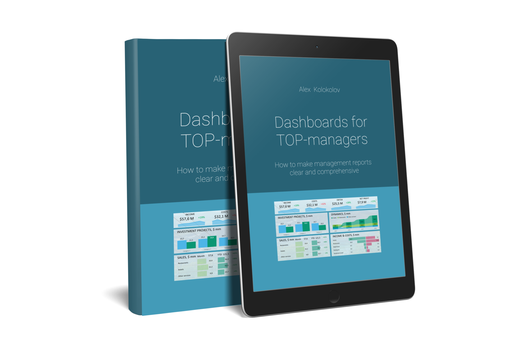
You'll find simple and precise rules for creating great dashboards in my book «Dashboards for TOP-Managers». We'll send you a free copy of it via email
Get my book and discover dashboard insights for free
+995 557 525 549
Georgia, Batumi, Ximshiashvili 7